 Color Fun
What Your Coloring Style Says About How You Think
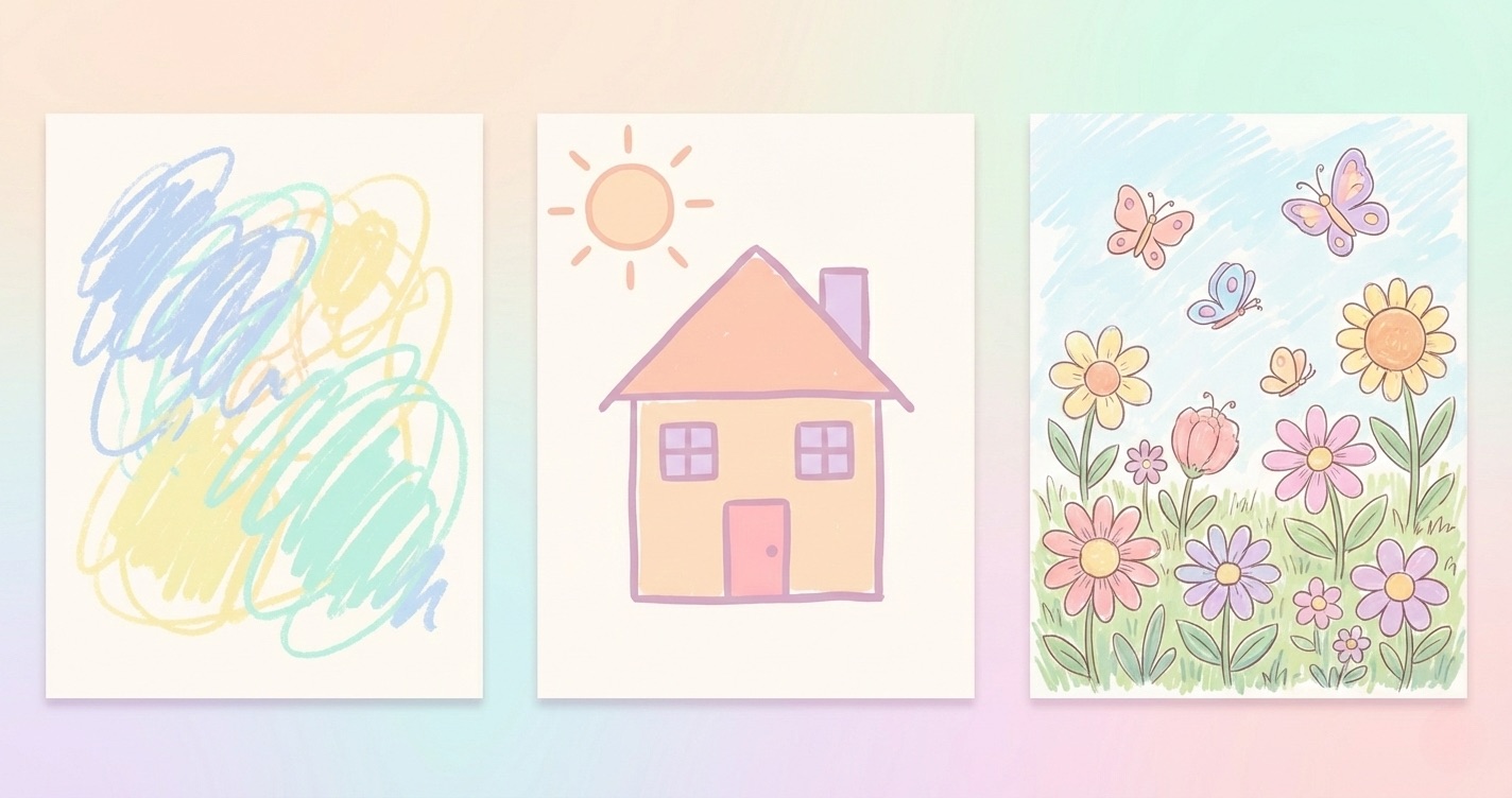
A progression showing increasingly complex and detailed coloring styles, from simple shapes to intricate linework, in soft pastel tones.
There's something oddly revealing about the moment someone picks up a coloring page for the first time. Some people scan the whole image before touching it, planning their palette like an architect with a blueprint. Others dive straight in from the top-left corner and work their way across. Some fill every section with painstaking precision; others embrace loose, expressive strokes that spill over the lines without a second thought.
None of these approaches is better than another. But they're not random either.
**The Planner vs. the Improviser**
If you find yourself choosing all your colors before you start, you likely approach other creative and cognitive tasks the same way — building a mental model first, then executing. There's comfort in having the full picture before committing to a single stroke.
The improviser, on the other hand, trusts that the page will tell them what it needs as they go. This isn't carelessness — it's a different relationship with uncertainty, one that often produces more spontaneous and surprising results.
Neither style is fixed. Part of what makes coloring valuable as a creative practice is that it's low-stakes enough to experiment with the other mode. Force yourself to plan if you usually improvise. Let go of the plan if you usually can't start without one.
**What Happens When You Stay Inside the Lines — or Don't**
The lines on a coloring page are an interesting psychological test. For some people, a line crossed is a minor disaster requiring immediate correction or abandonment. For others, it barely registers.
Psychologists who use art therapeutically note that our relationship with boundaries in creative work often mirrors our relationship with rules and expectations in everyday life. That's not a judgment — it's just worth noticing.
**Color Choice as Emotional Shorthand**
The colors we reach for first tend to reflect our current emotional state more than our considered aesthetic preferences. Warm colors — reds, oranges, yellows — are often associated with energy, urgency, and warmth. Cool colors — blues, greens, purples — tend toward calm, distance, and introspection.
Next time you sit down to color, pay attention to what you reach for first. You might learn something.
**Complexity Preference and Cognitive Load**
Some people find intricate, detailed coloring pages deeply satisfying. Others find them anxiety-inducing and prefer clean, simple shapes. Neither preference is a character flaw. The preference for complexity often correlates with a need for focused, absorbing tasks that fully occupy the mind. The preference for simplicity often reflects a desire for genuine rest — something that doesn't demand too much.
Color Fun lets you choose your complexity level: from clean minimalist outlines to intricate detailed illustrations. Start at https://colorfun.app/ and see which one feels right today.